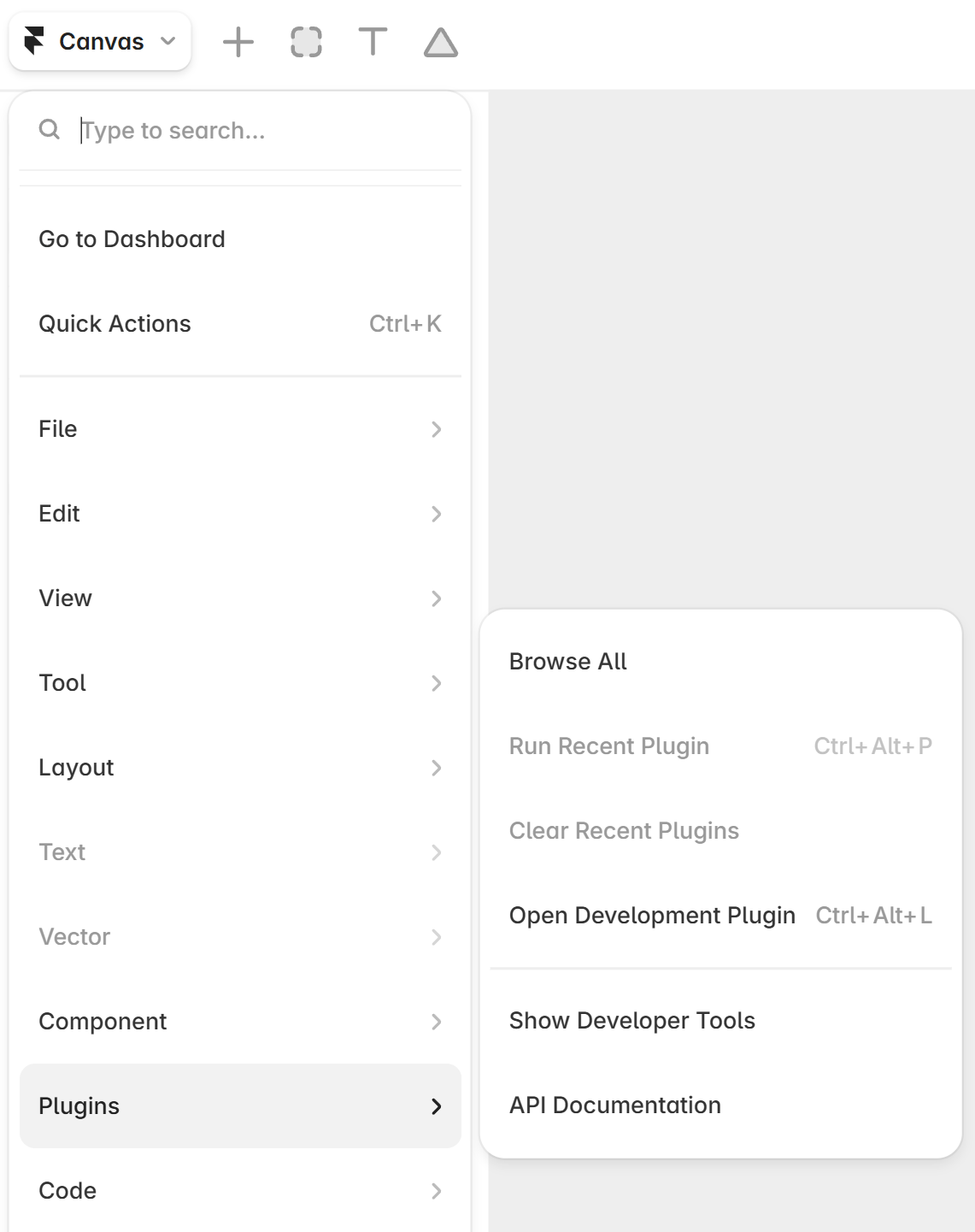
The Creem plugin for Framer lets you add checkout buttons and pricing tables to any Framer site without writing code. Connect your Creem account, pick your products, and insert a component. The plugin drops a live, fully styleable element straight onto your canvas.Creem acts as your Merchant of Record, so VAT, GST, and sales tax across 190+ countries are calculated, collected, and remitted for you. That makes this pairing a fast way to start selling from a Framer landing page, template, or marketing site.
What you'll learn
How to install the Creem plugin from the Framer Marketplace, connect your account, insert a checkout button and a pricing table, customize both directly on the canvas, and switch from test mode to live.
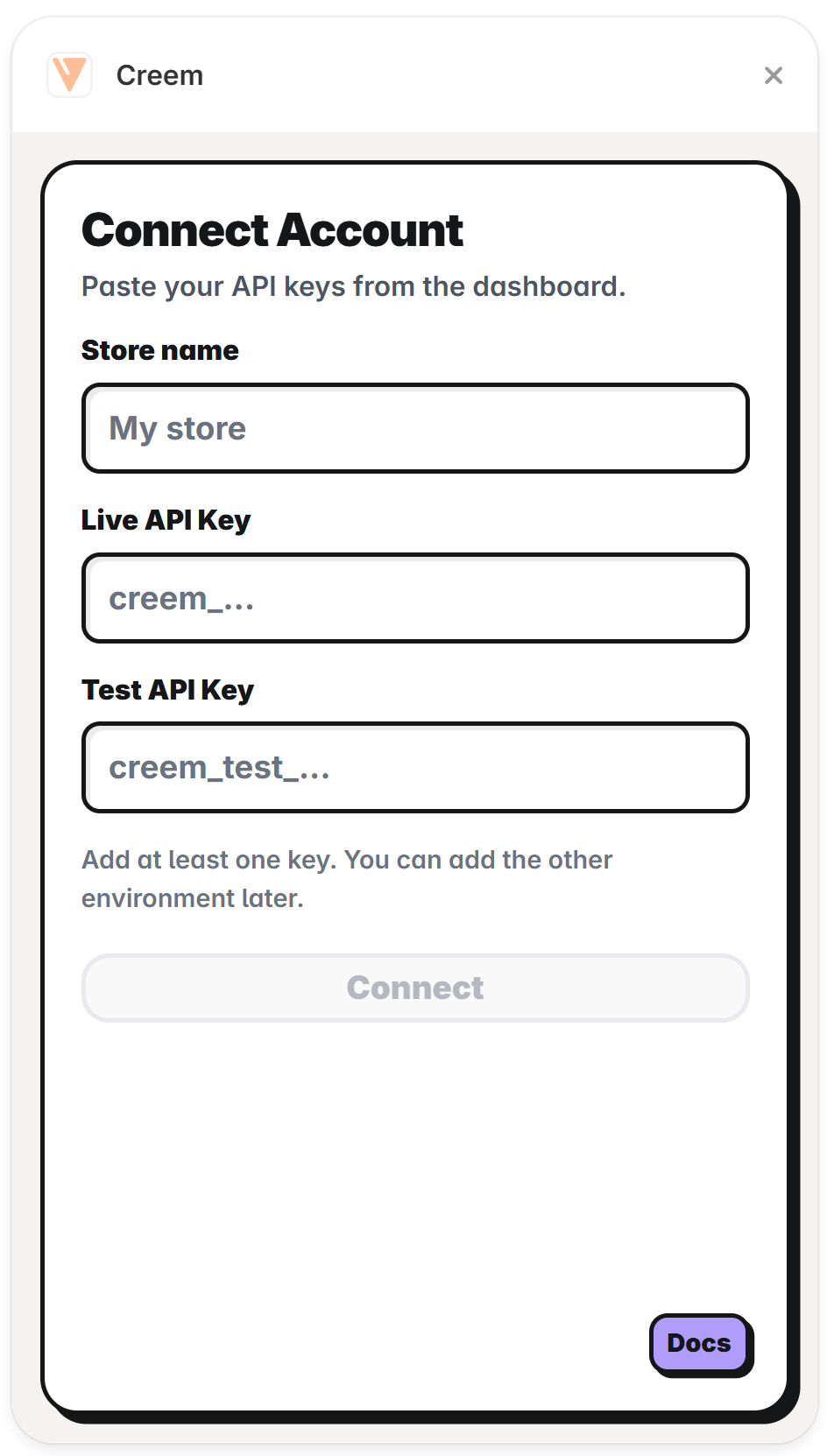
When you open the plugin for the first time, you can enter your Live Creem Store API Key, Test Creem Store API Key, or both, so you can browse either catalog and switch between them at any time.
Name your store and paste a Live and/or Test API keys
1
Copy your API keys
In the Creem dashboard, go to Developers →
API Keys and copy your keys. Live and test keys are separate (test keys are prefixed with
creem_test_).
2
Name your store
Enter a Store name so you can tell your stores apart later.
3
Paste your keys
Add at least one key. Paste your live key into Live API Key and your test key into Test
API Key. You can add the other environment later. The plugin routes each key to the right
environment by its prefix, so a key pasted into the wrong field is flagged.
4
Connect
Click Connect. The plugin validates the key, loads your products, and drops you into the
component picker.
Your API keys are stored locally in the plugin and used only to read your product list. They are
never embedded in the components you insert onto the canvas.
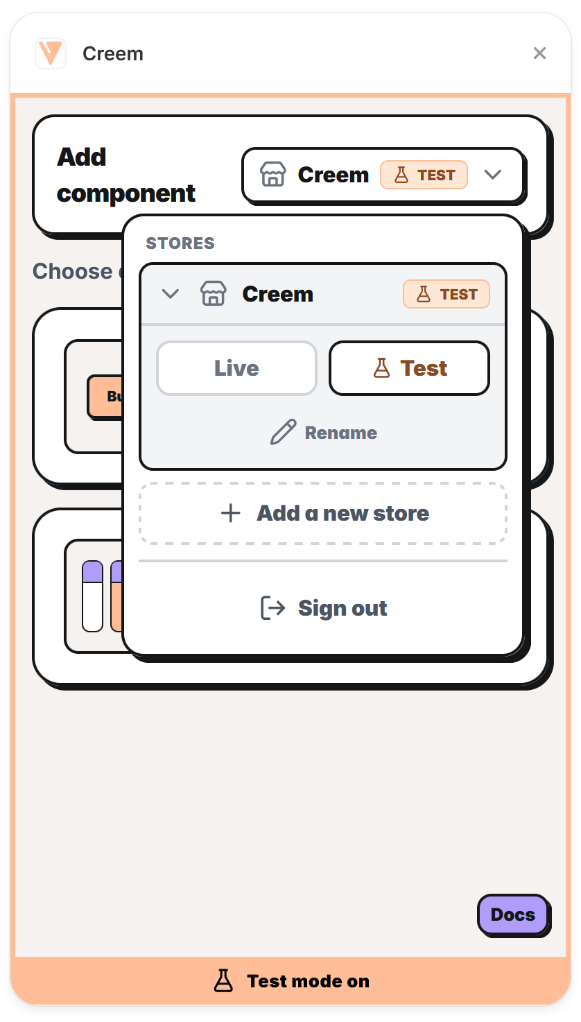
Once connected, the header shows a store switcher with the active store’s name and a Live or Test badge. Open it to switch stores, switch environments, or manage your keys.
The store switcher lets you switch stores, toggle Live and Test, and add or manage stores
From the switcher you can:
Switch environment: choose Live or Test for the active store. If that store has no key for the environment yet, you’re prompted to paste one inline. Product lists refresh automatically when you switch.
Switch store: select any other store to browse its products.
Add a new store: connect another Creem account or workspace.
Rename or Remove a store (you can’t remove your only store).
Sign out: remove all stores and return to the connect screen.
When the active environment is Test, the whole plugin gets a peach frame and a Test mode
on bar at the bottom, the same unmistakable signal as the Creem dashboard. See Test mode and
going live.
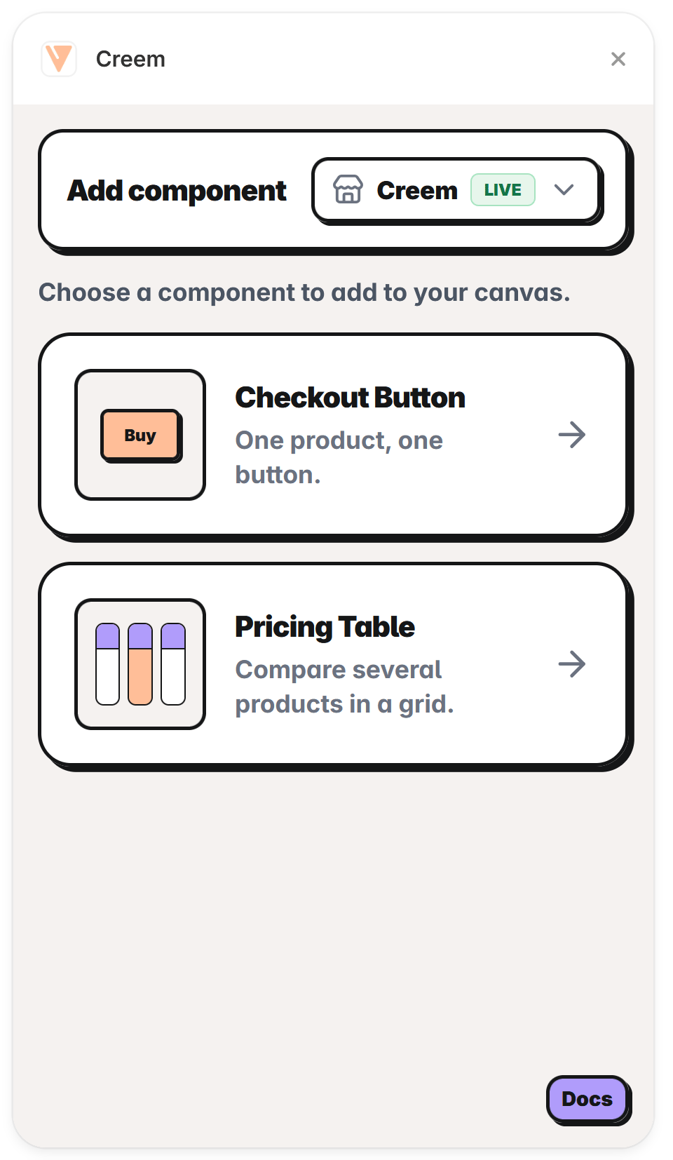
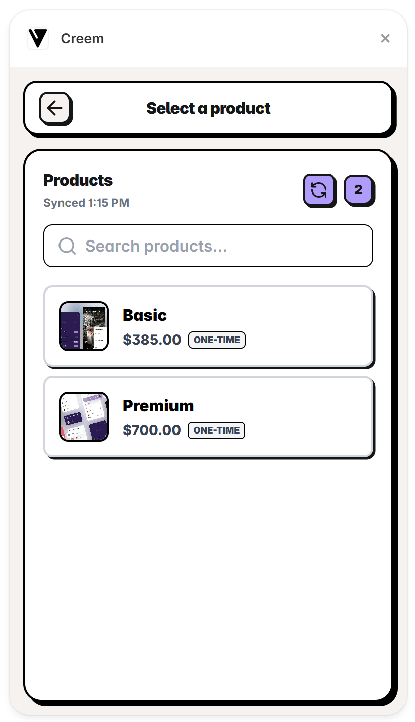
After connecting, choose the component to be added to your canvas. Pick a Checkout Button for a single product, or a Pricing Table to list pricing plans on your page.
A checkout button helps you sell a single product. It can either open checkout in a new tab or open it in a modal on the same page (the embed version).
1
Select a product
Search your products and select one. Picking a product advances you straight to configuration.
Select the product the button will sell
2
Configure the button
Choose how checkout opens, set the button text, and preview the result.
Configure checkout type and button text, with a live preview
3
Insert Button
Click Insert Button. The button appears on your canvas, ready to style. See Customize on the canvas for every option.
A pricing table lists several products side by side. You can mix one-time and subscription products in the same table.
1
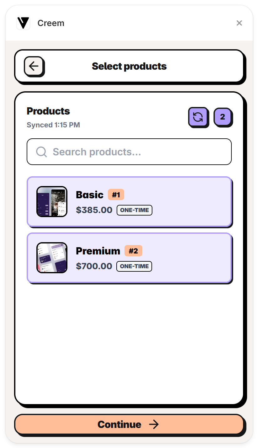
Select products
Search and select the products to include. Each product becomes its own tier.
Select the products to include as tiers
2
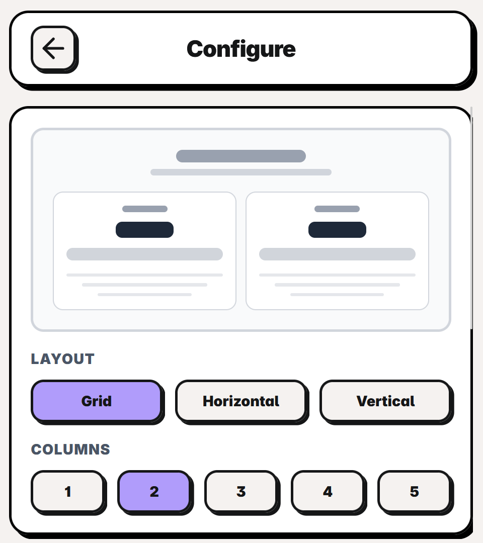
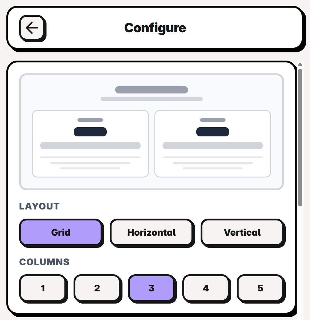
Pick a layout
Choose a Grid, Horizontal, or Vertical layout. For a grid, set the number of Columns (1 to 5). A live preview reflects your choices.
Choose the layout and column count
3
Set the heading
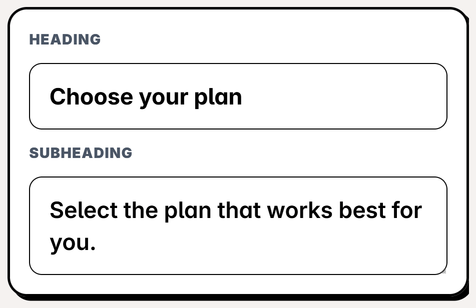
Add a Heading and Subheading for the table. Leave both empty to hide the header entirely.
Add a heading and subheading
4
Edit and order the tiers
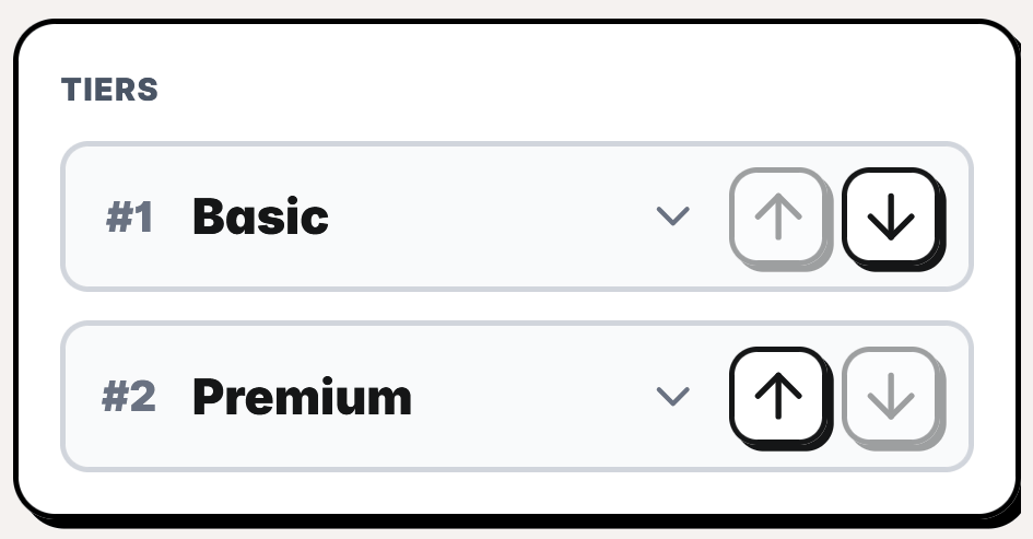
Reorder tiers with the up/down arrows, and expand any tier to edit it.
Reorder tiers and expand one to edit
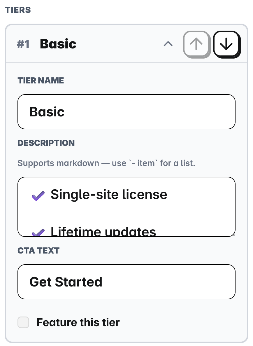
Each tier has a Tier Name, a Description, a CTA Text, and a Feature this tier toggle. The description takes the same Markdown you use for product descriptions in the Creem dashboard: - item for a bulleted feature list, plus headings, links, bold or italic text, etc…
Edit a tier's name, Markdown description, CTA, and featured state
Turn on Feature this tier to highlight a plan. The featured card gets a stronger border and shadow so it stands out. You can restyle featured cards on the canvas under Featured Tier.
5
Insert Pricing Table
Click Insert Pricing Table. The table appears on your canvas, ready to style.
The plugin supports every Creem product type and shows the correct price label for each.
Type
Description
Price label
One-time
A single purchase, no recurring billing
No suffix
Subscription
Recurring billing on a set schedule
/day, /month, /3 months, /6 months, /year
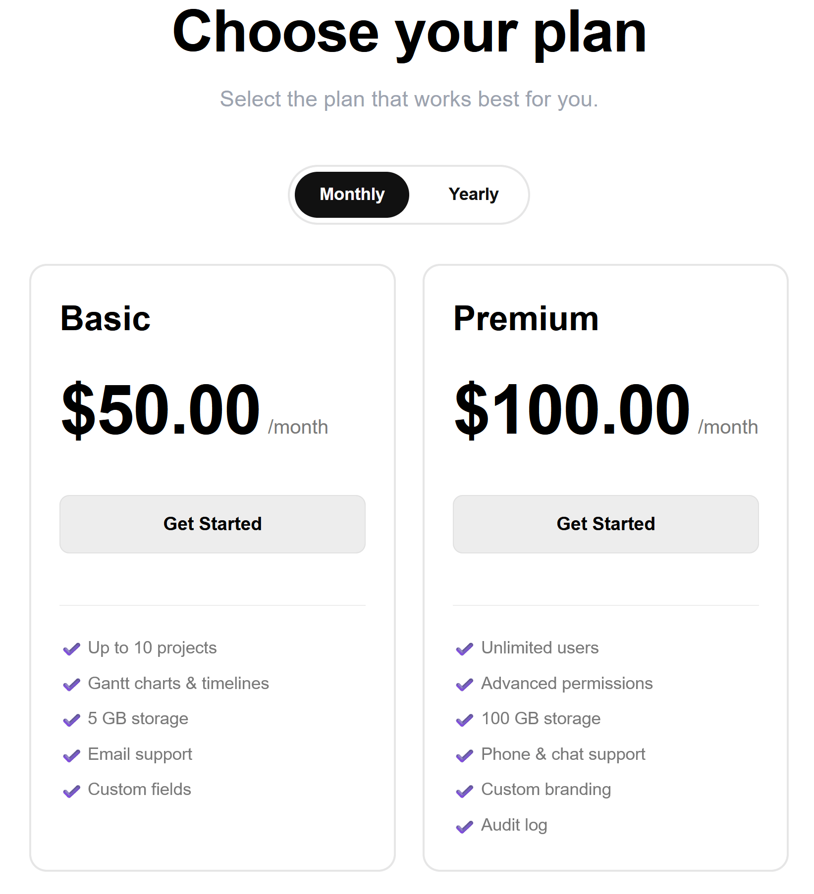
When a pricing table contains two or more subscription intervals (for example a Monthly and a Yearly plan), the component automatically shows a billing-interval toggle so visitors can switch between them. One-time products always stay visible. Tables with a single interval show no toggle.
A pricing table automatically shows an interval toggle when it has multiple subscription intervals
Interval tabs are labeled Daily, Monthly, Quarterly, Semi-annual, and Yearly. You can restyle the
toggle (Pill or Segmented, plus colors) on the canvas under Billing Toggle.
The plugin inserts each component with sensible defaults, then hands the rest to Framer. Colors, spacing, fonts, button styles, and copy all live in Framer’s property panel on the right, so you never reopen the plugin to restyle. Select the component on the canvas and the panel groups its controls by the part of the component they affect. Every change previews live, and the values you set travel with the component when you publish.
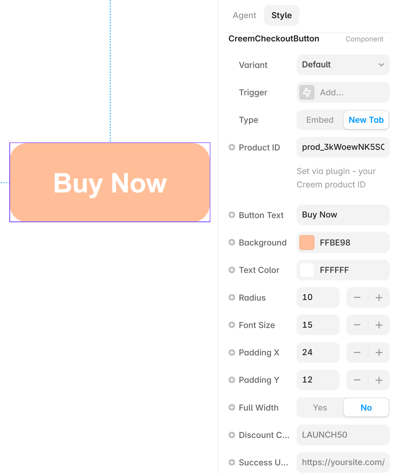
The button is one group of controls. The plugin fills in the product and a starting style (CreemCheckoutButton) at insert time, and everything below is yours to brand.
The checkout button and its property panel in Framer
Control
What it controls, and when to reach for it
Variant
The button’s visual style. Seven presets ship: Default (solid fill), Outline, Ghost (text only), Gradient, Shadow, Shimmer (animated sheen), and Icon Slide (an arrow that slides across on hover). All of them use the colors you set below, so choose the shape first and brand it after.
Type
Whether checkout opens as an Embed (a modal over the current page) or in a New Tab. Embed keeps buyers on your site, while New Tab is the safer choice when the button sits inside a restrictive embed or you want a full checkout window.
Product ID
The Creem product this button charges for. The plugin sets it at insert time, so you normally leave it untouched. Edit it only to repoint the button at a different product without re-inserting.
Button Text
The label on the button, such as “Buy now” or “Get the template”. Keep it short and action-led.
Background and Text Color
The fill and label colors. Defaults are Creem peach on white. Set both to match your brand or the section the button sits in.
Radius, Font Size, Padding X, Padding Y
The button’s shape and size. Radius rounds the corners (0 is square), Padding X and Y set the space around the label (its width and height), and Font Size scales the text.
Full Width
Stretches the button to fill its container. Turn it on for full-width calls to action in narrow columns or on mobile.
Discount Code
A Creem discount code applied automatically when checkout opens, so buyers never type it. Handy for launch or campaign buttons that should always carry the offer.
Success URL
Where the buyer lands after paying. Point it at a thank-you or onboarding page to continue the flow, or leave it empty to use the product’s default redirect.
Success URLs are optional. When set, they must be valid HTTPS URLs; unsupported or malformed
redirect targets are blocked before checkout opens.
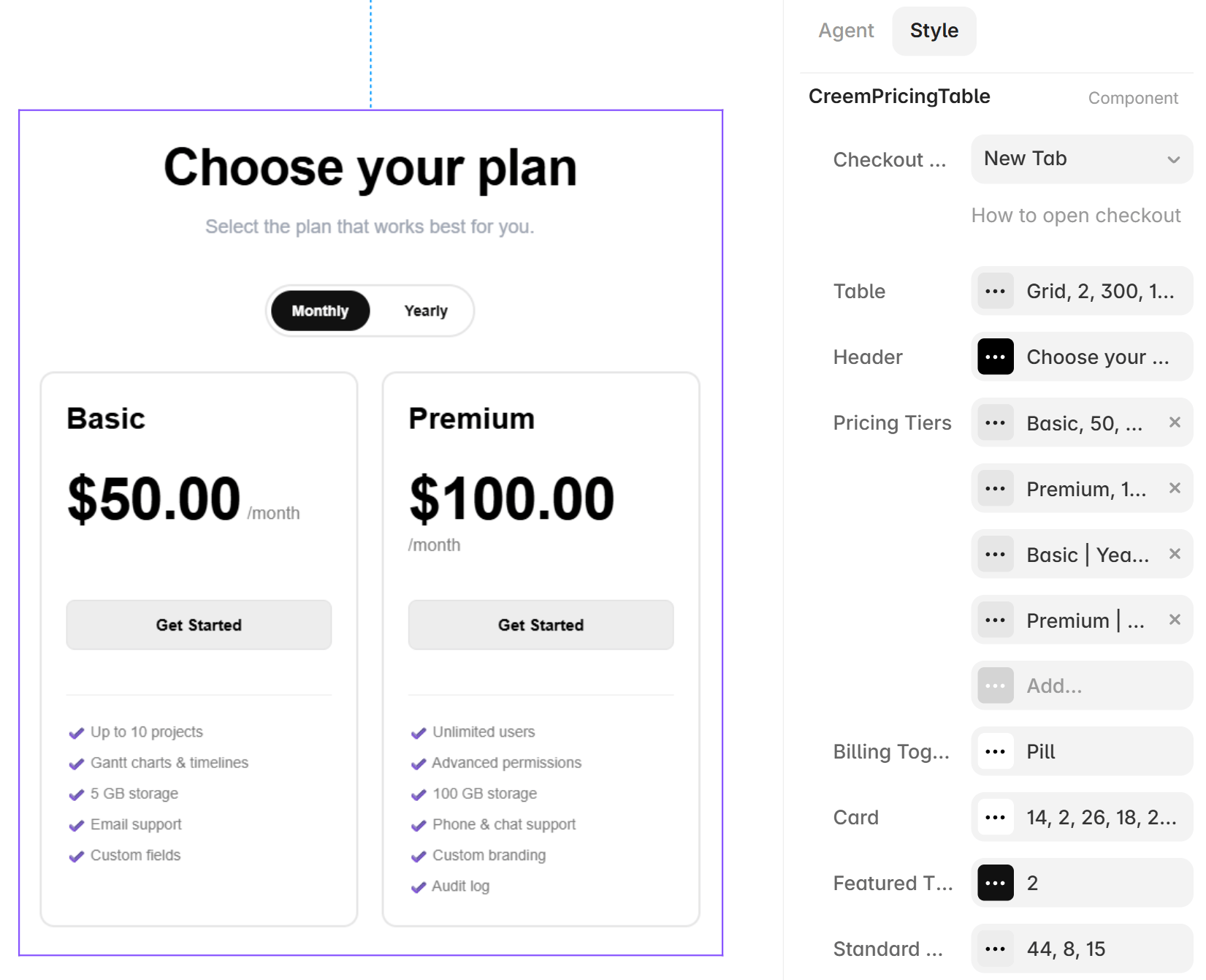
The pricing table splits its controls into groups (in the CreemPricingTable style), one per area of the table, matching the rows in the panel.
The pricing table's property panel in Framer
For an easier editing flow, make sure Table shape is as per your requirements, then style the Card, then set apart the Featured Tier and its buttons.
Table
Sets the table’s overall shape. Layout switches between a Grid, a Horizontal scroll row, and
a Vertical stack. For a grid, Grid Columns caps how many cards sit per row, while Min Card
Width and Grid Gap decide when cards wrap on smaller screens. Max Width stops the
table stretching too wide on large monitors, and Page Background paints the area behind the
cards. Start here to get the structure right before styling anything else.
Header
The title and subtitle above the cards, pre-filled from the heading you set when inserting.
Toggle the header off to drop it entirely, or set the Title and Description text,
Alignment (left, center, right), font sizes, and colors to match your page’s typography.
Pricing Tiers
The list of plans, one entry per card. Each tier holds its Name, Price, Currency,
and billing (a One-time purchase or a recurring Billing Period), the Product ID it
charges, the Button Text and Button Variant, optional per-tier button colors, a Markdown
Description, and a Featured flag. This is where you edit plan copy, correct a price or
its interval label, reorder cards, or add and remove tiers after inserting.
Billing Toggle
The Monthly/Yearly switch that appears automatically when the table holds two or more
subscription intervals (see Product types and billing
intervals). Choose its Style (Pill or Segmented) and
its colors, or hide it when you want a single interval on show.
Card
The look every card shares: Background, Border, and Divider colors and widths,
corner Radius, inner Padding and Gap, the text colors for headings, muted body copy,
and links, and the Title, Description, and Price font sizes. Set your neutral card
style here, and the featured card inherits it and overrides only its highlighted parts.
Featured Tier
The extra styling for whichever tier you marked Featured, covering its button colors and a
heavier border. Use it to make your recommended plan stand out from the standard cards without
restyling every card.
Standard Buttons
The default call-to-action style for non-featured tiers: button colors (fill, text, border),
Height, Radius, and Font Size. Featured tiers use the Featured Tier colors
instead, so set the everyday button look here and the highlight there.
Both components let you choose how checkout opens.
Option
What happens
Embed
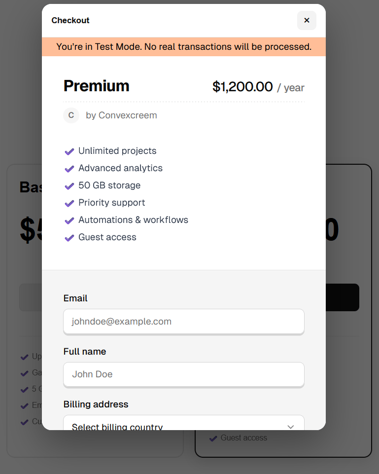
Opens checkout in a modal overlay on the same page
New Tab
Opens checkout in a new browser tab
Both options use Creem-hosted checkout at runtime. Test components open the test checkout URL and
Live components open the production checkout URL. If Creem or the visitor’s network is temporarily
unavailable, checkout cannot open or complete until connectivity is restored.
Embed opens checkout in a modal over your page
Checkout opens on your published site, not on the Framer canvas. Publish or preview your site to
test the full flow.
Test mode lets you build and preview without real charges. Switch a store to Test in the store switcher to browse your test catalog. A peach frame and a Test mode on bar make it obvious you’re in test.The environment is captured on each component at insert time. A component inserted while you’re in Test opens test checkout, and one inserted in Live opens live checkout.
Switching a store’s environment does not retroactively change components you already inserted.
When you’re ready to go live, switch the store to Live in the switcher and re-insert your
buttons and tables so they point at your live products.
Unconfigured products are blocked, not broken. If a button or tier’s Product ID is still the placeholder (prod_abc123) or left empty, most often after adding a tier by hand in the property panel instead of through the plugin, its checkout is blocked and the visitor sees an “isn’t available yet” message rather than a broken checkout. Fix it by setting a real Product ID on that tier or button (copy the ID from your product in the Creem dashboard), or re-insert the component through the plugin to pull in a valid product.
Inserting writes a code file and drops a component onto the canvas, which both need edit access.
Ask the project owner for edit permission on the Framer project.
"Still compiling" when inserting
Framer is still building the component’s code file. Wait a moment and click Insert again.
A tier shows "isn't available yet"
That tier or button’s Product ID is still the placeholder (prod_abc123) or empty, usually
from adding a tier directly in the property panel. Set a valid Product ID on it (copy the ID
from your product in the Creem dashboard), or re-insert the component through the plugin to
select a product from your list.
A product is missing from the list
The plugin lists active products. Make sure the product is active in your Creem dashboard, then
use the refresh button in the plugin to re-sync.