> ## Documentation Index
> Fetch the complete documentation index at: https://docs.creem.io/llms.txt
> Use this file to discover all available pages before exploring further.
# Subscriptions
> Subscription plans, billing cycles, trials, unit-based pricing, and scheduled changes with the Creem Convex component.
Plans, billing cycles, trials, unit-based pricing, and scheduled changes.
Examples on this page are fragments. They render inside the provider you mounted
in the [Quickstart](/code/sdks/convex/quickstart):
```svelte theme={null}
```
If something below does not work, one of these is usually missing. Each links
straight to the step that sets it up.
* [Component registered](/code/sdks/convex/quickstart#register-component) — `app.use(creem)` in `convex/convex.config.ts`
* [Secrets set](/code/sdks/convex/quickstart#set-secrets) — `CREEM_API_KEY` and `CREEM_WEBHOOK_SECRET` in Convex env
* [Billing API exported](/code/sdks/convex/quickstart#export-billing-api) — `convex/billing.ts` calling `creem.api({ resolve })`
* [Webhook registered](/code/sdks/convex/quickstart#register-webhook) — `creem.registerRoutes(http)` in `convex/http.ts`
* [Products created](/code/sdks/convex/quickstart#create-products) — one Creem product per plan and billing cycle
* [Products synced](/code/sdks/convex/quickstart#sync-products) — `npx convex run billing:syncBillingProducts`
* [Styles imported](/code/sdks/convex/quickstart#import-styles) — `@creem_io/convex/styles` after the Tailwind import
* [Catalog defined](/code/sdks/convex/quickstart#define-plans) — `billingCatalog` mapping plan IDs to product IDs
* [Provider mounted](/code/sdks/convex/quickstart#render-pricing-page) — `` around your billing UI
## Standard plans
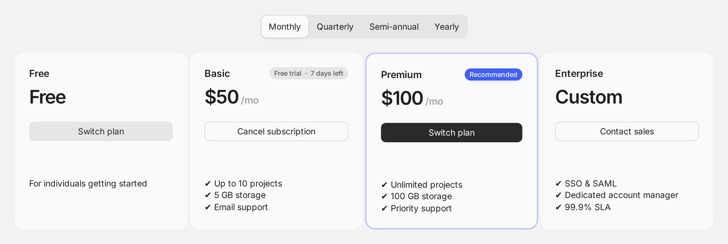
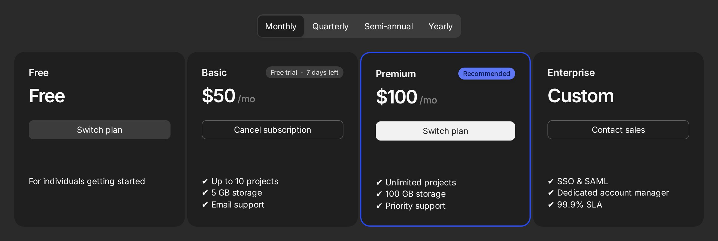
Render catalog plans by ID. Titles, descriptions (Markdown), and prices resolve from synced Creem product data:
```tsx title="Pricing page" theme={null}
```
That renders:
* Pricing cards, with a billing-cycle toggle that stays hidden when all plans share one cycle
* A "Current plan" badge on the active plan
* Plan switching, behind a confirmation dialog
* A trial countdown badge
* Cancel and resume, also behind confirmation
* A scheduled-cancellation banner with an undo button
 You can also register plans inline, without a catalog. This helps when migrating incrementally:
```tsx title="Pricing page" theme={null}
```
## Billing cycles
`creemProductIds` maps cycles to Creem products. Supported cycles: `every-month`, `every-three-months`, `every-six-months`, `every-year`. The interval selector appears automatically when plans expose more than one cycle:
You can also register plans inline, without a catalog. This helps when migrating incrementally:
```tsx title="Pricing page" theme={null}
```
## Billing cycles
`creemProductIds` maps cycles to Creem products. Supported cycles: `every-month`, `every-three-months`, `every-six-months`, `every-year`. The interval selector appears automatically when plans expose more than one cycle:

 Add badges to promote longer cycles:
```tsx title="Pricing page" theme={null}
```
## Trials
The component supports two trial paths:
* **Creem-managed trials** are configured on paid Creem products. In the catalog they stay `category: "paid"` recurring plans; Creem owns checkout, card collection, and the `subscription.trialing` state.
Declare the length with `trialDays`. The card then reads "Start free trial" instead of "Subscribe", with the length as microcopy beneath it:
```ts title="src/billingCatalog.ts" theme={null}
{
planId: "premium",
category: "paid",
billingType: "recurring",
trialDays: 14,
creemProductIds: { "every-month": "prod_..." },
}
```
`trialDays` is display only. Creem still runs the trial, and once the subscription exists the card switches to a live countdown from `trialEnd` and stops reading the field.
Creem's product API doesn't carry trial length yet, so the catalog is where the card learns it.
One effect worth knowing: the length lives in two places, so update the catalog whenever you
change the trial on the product. Prefer it to come from Creem instead? Two requests would get it
there: [trial information and duration in
`/v1/products`](https://creem.featurebase.app/p/expose-trial-information-and-duration-in-v1products),
so the component syncs it alongside price and title, or [Creem as
Code](https://creem.featurebase.app/p/creem-as-code-cli-based-product-and-billing-configuration),
so the product and its trial are defined together in your repo.
* **App-owned no-card trials** use `category: "trial"` with `billingType: "custom"`. No Creem subscription is created. The component records activation history and the current app-plan assignment, which is what lets the billing UI show, activate, and hide the offer.
An app-owned trial that can only be used once per billing entity, and disappears once the entity picks a real plan in the same product line:
```ts title="src/billingCatalog.ts" theme={null}
export const billingCatalog = defineBillingCatalog({
plans: [
{
planId: "trial",
category: "trial",
billingType: "custom",
eligibilityScopeId: "base",
eligibility: {
oncePerEntity: true,
hideWhenIneligible: true,
expiresWhenScopeHasNonTrialPlan: true,
},
limits: { aiMessages: 5 },
},
{
planId: "free",
category: "free",
billingType: "custom",
eligibilityScopeId: "base",
},
{
planId: "premium",
category: "paid",
billingType: "recurring",
eligibilityScopeId: "base",
creemProductIds: { "every-month": "prod_..." },
},
],
} as const);
```
To let users activate the trial (or any app-owned plan), expose `plans.activate` in your connected API with an app mutation that calls:
```ts title="convex/billing.ts" theme={null}
await creem.appPlans.activate(ctx, {
entityId,
planId: "trial",
activatedByUserId,
});
```
The component enforces the once-per-entity rule and hides ineligible trial cards. Your app still owns quota enforcement and lock states.
`eligibilityScopeId` and `groupId` are different axes: use `groupId` for pricing layout/audience
tabs, and `eligibilityScopeId` for mutually exclusive entitlement alternatives. Scoped expiry only
looks at active or scheduled non-trial plans in the *same* scope, so an add-on trial in an
`"analytics-addon"` scope stays available after the customer picks a base plan.
Use `onBeforePlanActivation` (provider- or widget-level) for sign-in or consent gates before activation.
## Unit-based pricing
Two workflows for quantity-based plans (seats are one kind of unit):
**User-selectable units.** The customer picks a quantity before checkout:
```tsx title="Pricing page" theme={null}
```
**Auto-derived units.** Pass a fixed count from app state, such as an org member count:
```tsx title="Pricing page" theme={null}
```
When `subscriptions.update` is in the connected API, active unit-based plans show a "Change units" control.
For auto-derived units, keep the subscription in sync: when your member count changes, call
`subscriptions.update` with the new `units` so billing reflects the current quantity.
## Plan groups
Split plans by audience (e.g. Individual vs Teams). The root renders a group selector and derives billing cycles from the active group only:
```tsx title="Pricing page" theme={null}
```
Add badges to promote longer cycles:
```tsx title="Pricing page" theme={null}
```
## Trials
The component supports two trial paths:
* **Creem-managed trials** are configured on paid Creem products. In the catalog they stay `category: "paid"` recurring plans; Creem owns checkout, card collection, and the `subscription.trialing` state.
Declare the length with `trialDays`. The card then reads "Start free trial" instead of "Subscribe", with the length as microcopy beneath it:
```ts title="src/billingCatalog.ts" theme={null}
{
planId: "premium",
category: "paid",
billingType: "recurring",
trialDays: 14,
creemProductIds: { "every-month": "prod_..." },
}
```
`trialDays` is display only. Creem still runs the trial, and once the subscription exists the card switches to a live countdown from `trialEnd` and stops reading the field.
Creem's product API doesn't carry trial length yet, so the catalog is where the card learns it.
One effect worth knowing: the length lives in two places, so update the catalog whenever you
change the trial on the product. Prefer it to come from Creem instead? Two requests would get it
there: [trial information and duration in
`/v1/products`](https://creem.featurebase.app/p/expose-trial-information-and-duration-in-v1products),
so the component syncs it alongside price and title, or [Creem as
Code](https://creem.featurebase.app/p/creem-as-code-cli-based-product-and-billing-configuration),
so the product and its trial are defined together in your repo.
* **App-owned no-card trials** use `category: "trial"` with `billingType: "custom"`. No Creem subscription is created. The component records activation history and the current app-plan assignment, which is what lets the billing UI show, activate, and hide the offer.
An app-owned trial that can only be used once per billing entity, and disappears once the entity picks a real plan in the same product line:
```ts title="src/billingCatalog.ts" theme={null}
export const billingCatalog = defineBillingCatalog({
plans: [
{
planId: "trial",
category: "trial",
billingType: "custom",
eligibilityScopeId: "base",
eligibility: {
oncePerEntity: true,
hideWhenIneligible: true,
expiresWhenScopeHasNonTrialPlan: true,
},
limits: { aiMessages: 5 },
},
{
planId: "free",
category: "free",
billingType: "custom",
eligibilityScopeId: "base",
},
{
planId: "premium",
category: "paid",
billingType: "recurring",
eligibilityScopeId: "base",
creemProductIds: { "every-month": "prod_..." },
},
],
} as const);
```
To let users activate the trial (or any app-owned plan), expose `plans.activate` in your connected API with an app mutation that calls:
```ts title="convex/billing.ts" theme={null}
await creem.appPlans.activate(ctx, {
entityId,
planId: "trial",
activatedByUserId,
});
```
The component enforces the once-per-entity rule and hides ineligible trial cards. Your app still owns quota enforcement and lock states.
`eligibilityScopeId` and `groupId` are different axes: use `groupId` for pricing layout/audience
tabs, and `eligibilityScopeId` for mutually exclusive entitlement alternatives. Scoped expiry only
looks at active or scheduled non-trial plans in the *same* scope, so an add-on trial in an
`"analytics-addon"` scope stays available after the customer picks a base plan.
Use `onBeforePlanActivation` (provider- or widget-level) for sign-in or consent gates before activation.
## Unit-based pricing
Two workflows for quantity-based plans (seats are one kind of unit):
**User-selectable units.** The customer picks a quantity before checkout:
```tsx title="Pricing page" theme={null}
```
**Auto-derived units.** Pass a fixed count from app state, such as an org member count:
```tsx title="Pricing page" theme={null}
```
When `subscriptions.update` is in the connected API, active unit-based plans show a "Change units" control.
For auto-derived units, keep the subscription in sync: when your member count changes, call
`subscriptions.update` with the new `units` so billing reflects the current quantity.
## Plan groups
Split plans by audience (e.g. Individual vs Teams). The root renders a group selector and derives billing cycles from the active group only:
```tsx title="Pricing page" theme={null}
```
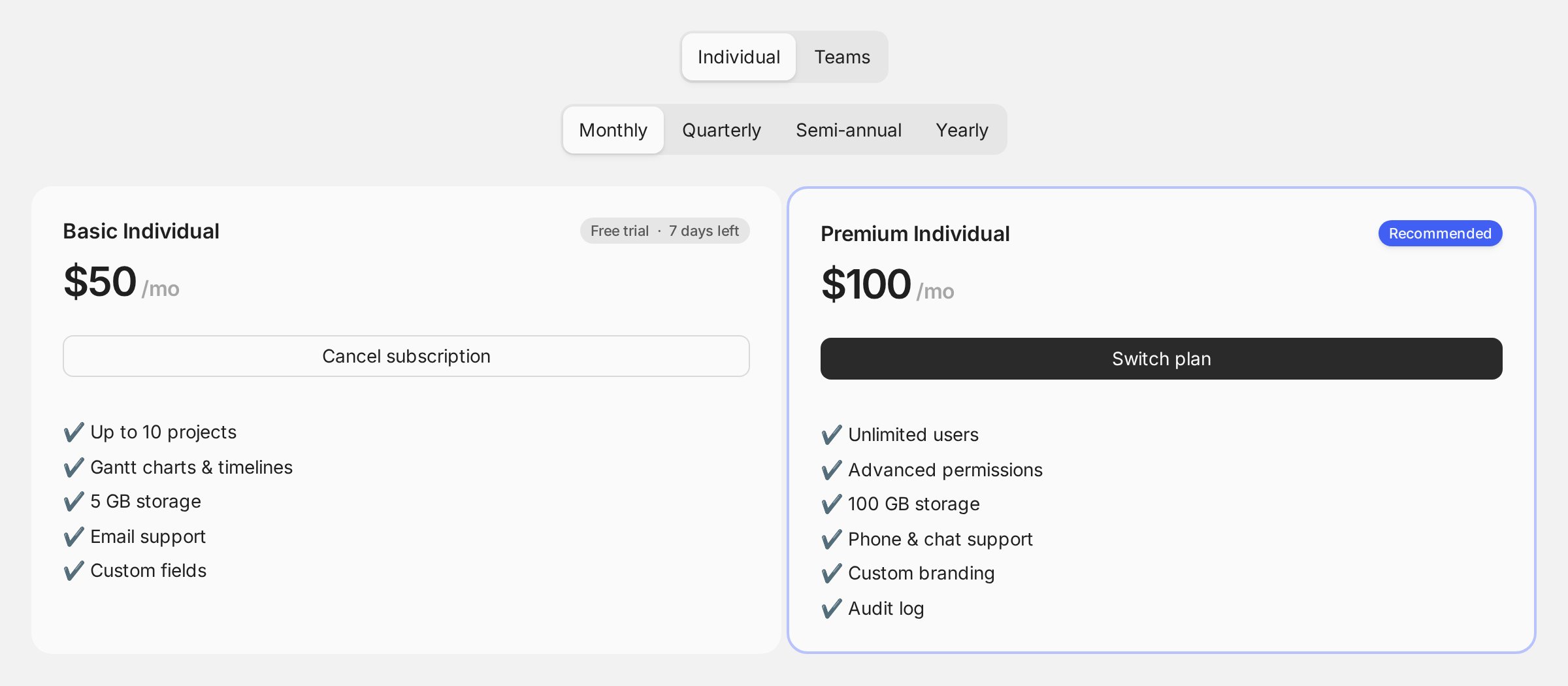
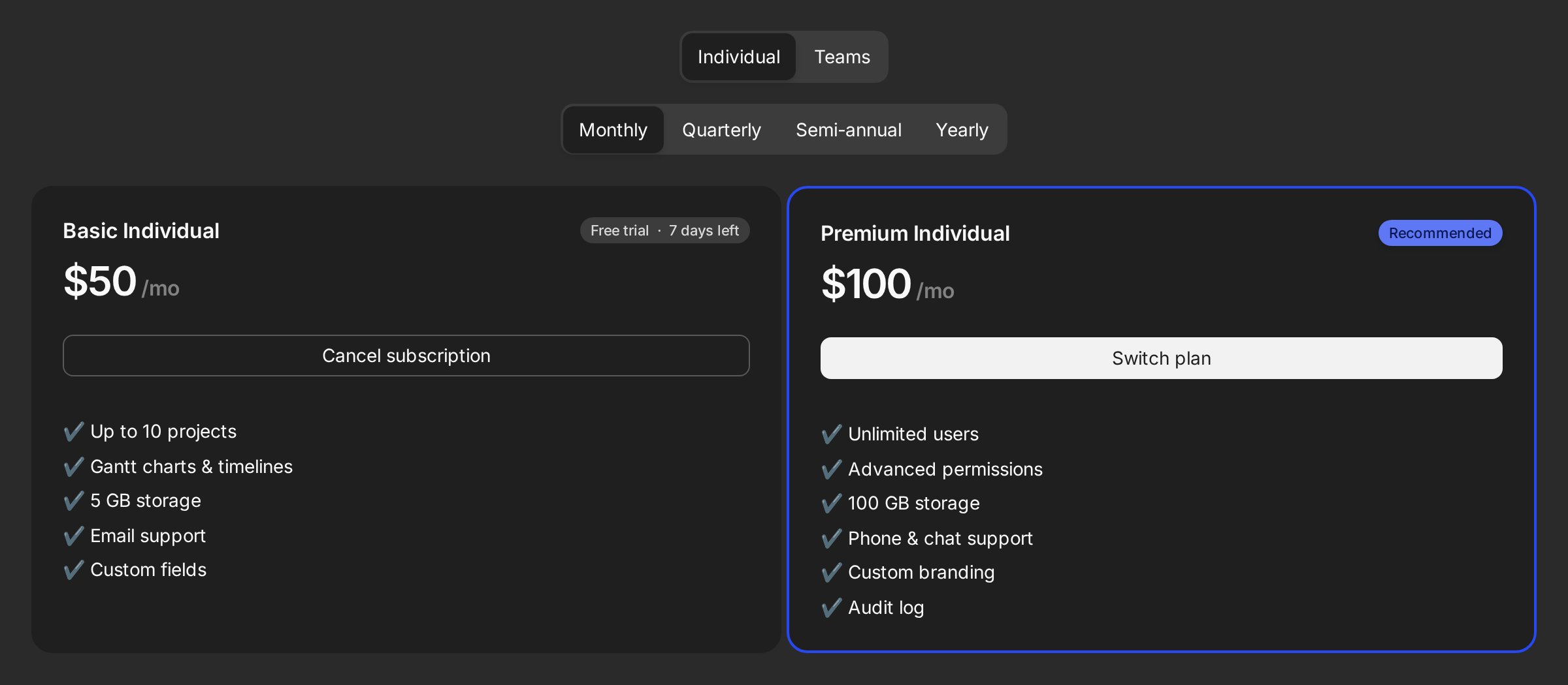 Control placement with `groupSelector="auto" | "hidden" | "external"` (use `` for external composition), and `group`/`onGroupChange` for controlled state.
## Scheduled changes: upgrades, downgrades, and paid-to-app-owned
`updateBehavior` controls paid-to-paid switches and unit changes:
* `"proration-charge-immediately"` prorates and charges now. This is the default.
* `"proration-charge"` prorates and puts the difference on the next invoice.
* `"proration-none"` skips proration; the change applies next billing cycle.
* `"period-end"` keeps the current subscription until `currentPeriodEnd`, then applies the change from a scheduled Convex job.
Pass a resolver to treat upgrades and downgrades differently:
```tsx title="Pricing page" theme={null}
{
if (intent.fromPrice != null && intent.toPrice != null && intent.toPrice < intent.fromPrice) {
return "period-end"; // downgrades apply at period end
}
return "proration-charge"; // upgrades prorate
}}
appPlanUpdateBehavior="period-end"
/>
```
Switches are confirmed in a dialog that spells out the effect of the behaviour you chose:
Control placement with `groupSelector="auto" | "hidden" | "external"` (use `` for external composition), and `group`/`onGroupChange` for controlled state.
## Scheduled changes: upgrades, downgrades, and paid-to-app-owned
`updateBehavior` controls paid-to-paid switches and unit changes:
* `"proration-charge-immediately"` prorates and charges now. This is the default.
* `"proration-charge"` prorates and puts the difference on the next invoice.
* `"proration-none"` skips proration; the change applies next billing cycle.
* `"period-end"` keeps the current subscription until `currentPeriodEnd`, then applies the change from a scheduled Convex job.
Pass a resolver to treat upgrades and downgrades differently:
```tsx title="Pricing page" theme={null}
{
if (intent.fromPrice != null && intent.toPrice != null && intent.toPrice < intent.fromPrice) {
return "period-end"; // downgrades apply at period end
}
return "proration-charge"; // upgrades prorate
}}
appPlanUpdateBehavior="period-end"
/>
```
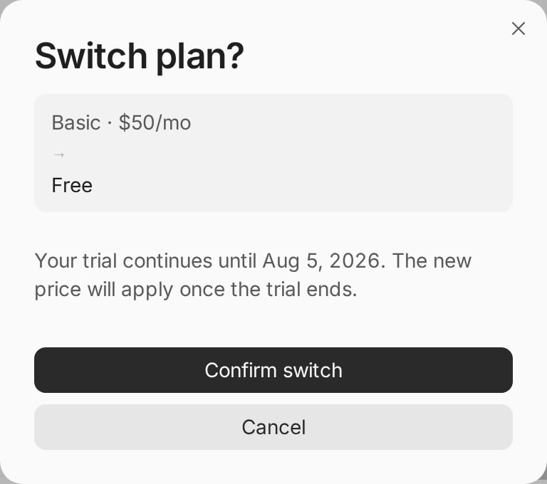
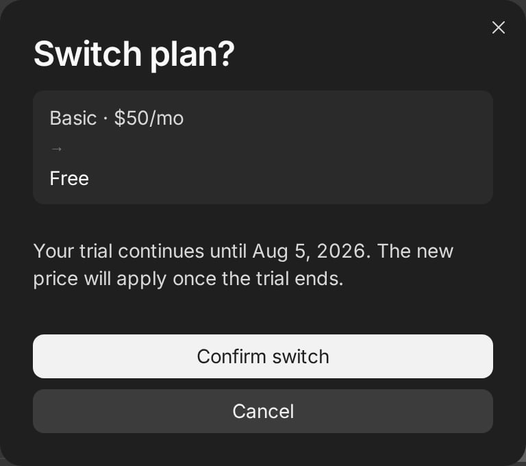
Switches are confirmed in a dialog that spells out the effect of the behaviour you chose:
 Paid-to-app-owned is a cancellation flow rather than a Creem proration. This
includes free plans, no-card trials, and custom entitlements fulfilled by your
app. It has its own setting, `appPlanUpdateBehavior`:
* `"period-end"` schedules Creem cancellation for the period boundary, then activates the app-owned target plan at that time. This is the default.
* `"immediate"` cancels straight away and assigns the app-owned target plan now.
Export `subscriptions.cancelScheduledUpdate` in your connected API to give users an "Undo" for pending period-end changes; if the pending change was paid-to-app-owned, undoing also resumes the Creem scheduled cancellation.
**Handled in Convex today.** Free plans and period-end changes are tracked by this component, so
both work without extra wiring. One effect worth knowing: the Creem portal only knows the current
subscription, so surface pending changes yourself with `ScheduledChangeBanner`. Prefer this
handled by Creem directly? Vote for [free subscription
tiers](https://creem.featurebase.app/p/free-subscription-tiers) and [scheduled subscription
updates](https://creem.featurebase.app/p/scheduled-subscription-updates).
## Custom card composition
When your design needs its own markup, keep the root and compose the pieces with `unstyled`. The root still owns checkout, switching, cancel, units, and active state:
```tsx title="src/PricingPage.tsx" theme={null}
```
```svelte title="src/routes/+page.svelte" theme={null}
```
Every slot resolves its content from the surrounding `` context. Slots placed
directly inside `` have no item to read from, so they throw at render time.
Wrap each card in a ``.
In styled mode, the library's defaults live in the base cascade layer, so your `class`/`className` utilities override them without `tailwind-merge`. `` reads the root's `columns` prop, so a composed layout and the default cards resolve their column count the same way.
## Typed bindings
For production apps, `createCreemReact` and `createCreemSvelte` bundle catalog, API, and defaults into one typed object. Plan IDs then autocomplete and stay checked:
```ts title="src/billingCatalog.ts" theme={null}
const billing = createCreemReact({
catalog: billingCatalog,
api: connectedApi,
defaultCycle: "every-month",
});
// billing.planIds, billing.catalog, billing.api, billing.defaultCycle
```
## What to keep in mind
* `subscriptions.update`, `cancel`, `resume`, and `cancelScheduledUpdate` in the connected API each unlock their controls; omit what you don't want users doing.
* UI permissions are cosmetic. Server functions must still check real access. See [Advanced → Custom auth and RBAC](/code/sdks/convex/advanced#custom-auth-and-rbac).
* The full prop reference for `Subscription.Root`, `Subscription.Item`, and every slot component lives in the [Reference](/code/sdks/convex/reference#component-reference).
Paid-to-app-owned is a cancellation flow rather than a Creem proration. This
includes free plans, no-card trials, and custom entitlements fulfilled by your
app. It has its own setting, `appPlanUpdateBehavior`:
* `"period-end"` schedules Creem cancellation for the period boundary, then activates the app-owned target plan at that time. This is the default.
* `"immediate"` cancels straight away and assigns the app-owned target plan now.
Export `subscriptions.cancelScheduledUpdate` in your connected API to give users an "Undo" for pending period-end changes; if the pending change was paid-to-app-owned, undoing also resumes the Creem scheduled cancellation.
**Handled in Convex today.** Free plans and period-end changes are tracked by this component, so
both work without extra wiring. One effect worth knowing: the Creem portal only knows the current
subscription, so surface pending changes yourself with `ScheduledChangeBanner`. Prefer this
handled by Creem directly? Vote for [free subscription
tiers](https://creem.featurebase.app/p/free-subscription-tiers) and [scheduled subscription
updates](https://creem.featurebase.app/p/scheduled-subscription-updates).
## Custom card composition
When your design needs its own markup, keep the root and compose the pieces with `unstyled`. The root still owns checkout, switching, cancel, units, and active state:
```tsx title="src/PricingPage.tsx" theme={null}
```
```svelte title="src/routes/+page.svelte" theme={null}
```
Every slot resolves its content from the surrounding `` context. Slots placed
directly inside `` have no item to read from, so they throw at render time.
Wrap each card in a ``.
In styled mode, the library's defaults live in the base cascade layer, so your `class`/`className` utilities override them without `tailwind-merge`. `` reads the root's `columns` prop, so a composed layout and the default cards resolve their column count the same way.
## Typed bindings
For production apps, `createCreemReact` and `createCreemSvelte` bundle catalog, API, and defaults into one typed object. Plan IDs then autocomplete and stay checked:
```ts title="src/billingCatalog.ts" theme={null}
const billing = createCreemReact({
catalog: billingCatalog,
api: connectedApi,
defaultCycle: "every-month",
});
// billing.planIds, billing.catalog, billing.api, billing.defaultCycle
```
## What to keep in mind
* `subscriptions.update`, `cancel`, `resume`, and `cancelScheduledUpdate` in the connected API each unlock their controls; omit what you don't want users doing.
* UI permissions are cosmetic. Server functions must still check real access. See [Advanced → Custom auth and RBAC](/code/sdks/convex/advanced#custom-auth-and-rbac).
* The full prop reference for `Subscription.Root`, `Subscription.Item`, and every slot component lives in the [Reference](/code/sdks/convex/reference#component-reference).